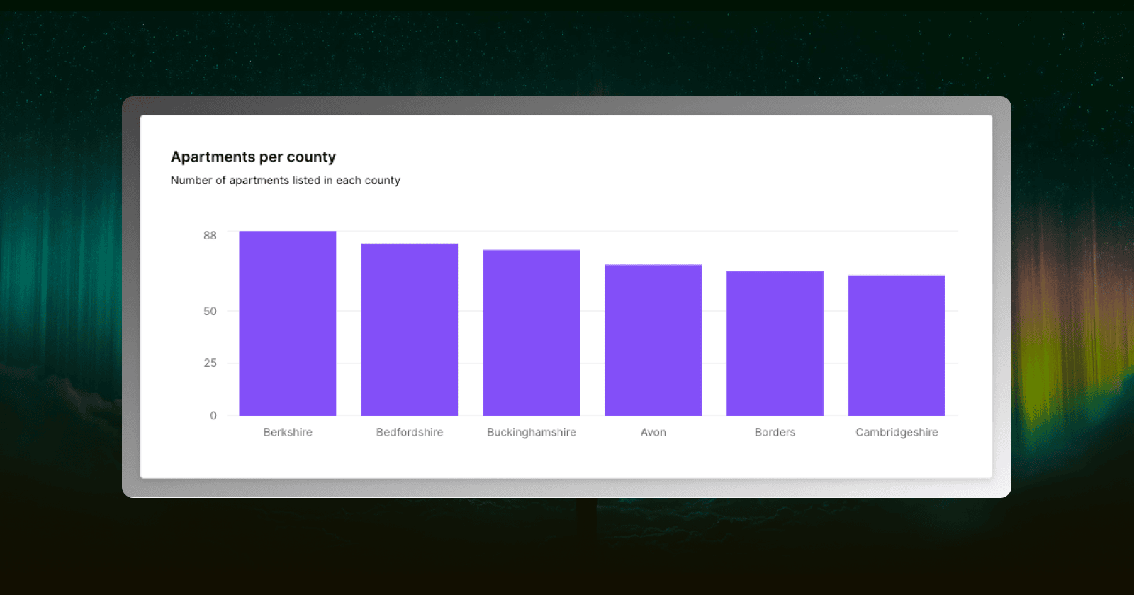
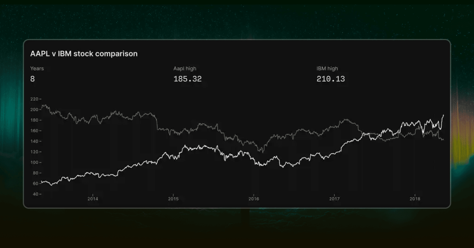
Data should be beautiful, or at least that’s what we at Outerbase and 21 million users on Reddit believe. Good charts let you see patterns and insights you’d otherwise miss. Yet too often, charting data is an afterthought, something tacked on at the end rather than built into the way you understand your data. We decided to change that in Outerbase.
In case you missed it, we recently launched a new dashboard experience at Outerbase called Boards. That was the first step toward making business intelligence feel intuitive and clean. The next step is to improve how we turn raw numbers into visuals you can absorb at a glance. This means giving you charts that look good, are also easy to customize and embed, and that feel like a natural extension of your brand.

Reflecting Your Brand
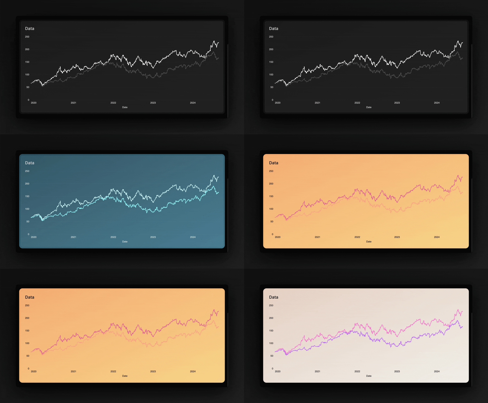
Something we have heard frequently from users was that they wanted charts that didn’t just look good—they wanted charts that looked like their charts. This might seem like a small detail. But when you’re putting charts directly into your own app or slide deck, style matters. If your product has a certain color scheme or feel, you don’t want charts that look like they were slapped in there randomly. You want charts that fit right in, as if they were hand crafted by your own engineering team.
And if you were interested in embedding, it couldn’t be a one size fits all solution, often times users wanted to embed into something entirely different than what we were expecting. Some teams use React, others don’t. We wanted anyone to be able to embed Outerbase charts without hitting a wall of technical requirements. That meant we needed a charting solution that was flexible enough to stand on its own—something we could ship as a web component and know it would work anywhere.

The Journey To Get Here
We tried multiple data visualization libraries before settling on one that felt right. Each taught us something different about what we needed.
We started with the Tremor library. Tremor’s charts were beautiful and straightforward, which was great. But we found it hard to reshape them into something that reflected our brand, let alone our user's brand. Under the hood, Tremor relied on Recharts, which made turning them into web components more trouble than it was worth. They looked nice, but we couldn’t easily make them truly ours or integrate them everywhere we wanted.
Next, we tried Observable Plot. The appeal here was the opposite: it gave us fine-grained control. We could tweak almost anything. And it was easier to turn Plot charts into web components. But Plot was particular about how you defined charts and what data you fed them. This wasn’t just a small bump; it made it hard to create a general, plug-and-play experience for a wide range of users. It also lacked common chart types people asked for, including the Pie Chart.
We learned from each step and we have nothing negative to say with any of the libraries we tried, they all have their use cases. Ours was just unique. Tremor showed us the value of simplicity. Plot reminded us how useful customization can be. But we still needed a tool that felt expansive yet manageable, and that we could shape to fit everyone’s data—without forcing you to reshape your data to fit it.

Why ECharts
That’s when we found ECharts. Backed by Apache and widely used, which gave us confidence in it having a strong foundation. It also offers a broad range of chart types and features. It’s flexible enough to integrate with any brand, and it can be built into a web component without making you jump through hoops.
Furthermore, with ECharts, we can now support new chart types like Pie, Radar, and Funnel. It enabled us to provide much more granular customization. Now you can easily tune colors, themes, backgrounds, and sizing. Instead of having to wrestle with code or settle for whatever default style we hand you, you can shape your charts so they feel like they came from your own design team.
Charting the Future
These new charts set the stage for future features: offering drilling down into charts for more detail, caching data so charts load instantly, and eventually revealing deeper insights that are hard to spot otherwise. We started this journey wanting to make charts that weren’t just pretty and “nice to have,” but essential. With our new charts we are well on that path.
When we first set out to improve charts, we knew we wanted two things: easy to build beautiful data visualization that fit our vision and brand, and ones that could match your brand without friction. With our new charts, we think we’ve found it.
Conclusion
Good charts aren’t just beautiful, they're informative. They are a way to understand data almost instantly. They help you see what you’ve been missing by just staring at rows and columns, and help you share that understanding with others. With our new charts, we’re giving you something that’s flexible, easy to embed, and genuinely yours. We’re still building toward an ideal charting experience, and we hope each new improvement makes Outerbase feel less like software you use and more like software you made.


